Trst, a Canadian biometric identity verification startup, needed to evolve from a technology-first narrative to a benefits-driven positioning that would resonate with enterprise clients across multiple industries. As businesses increasingly demand secure, frictionless, and scalable identity solutions, Trst required both strategic clarity and visual differentiation to compete in the growing verification market.
I collaborated with Trst team to define their core product concept, establishing the strategic framework that would guide all communication efforts. This foundational work shifted focus from technical capabilities to tangible business outcomes—security without friction, compliance without complexity.
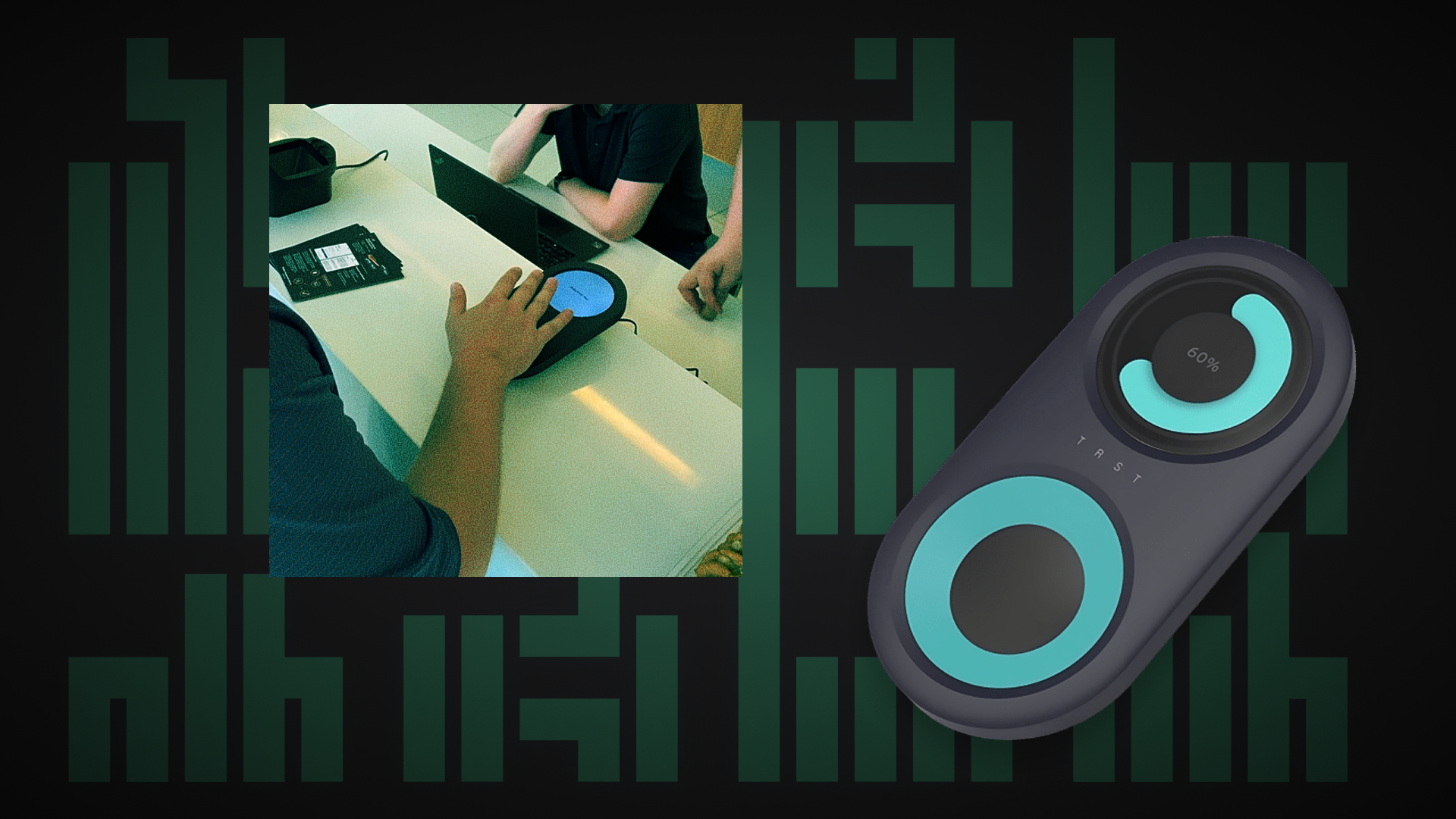
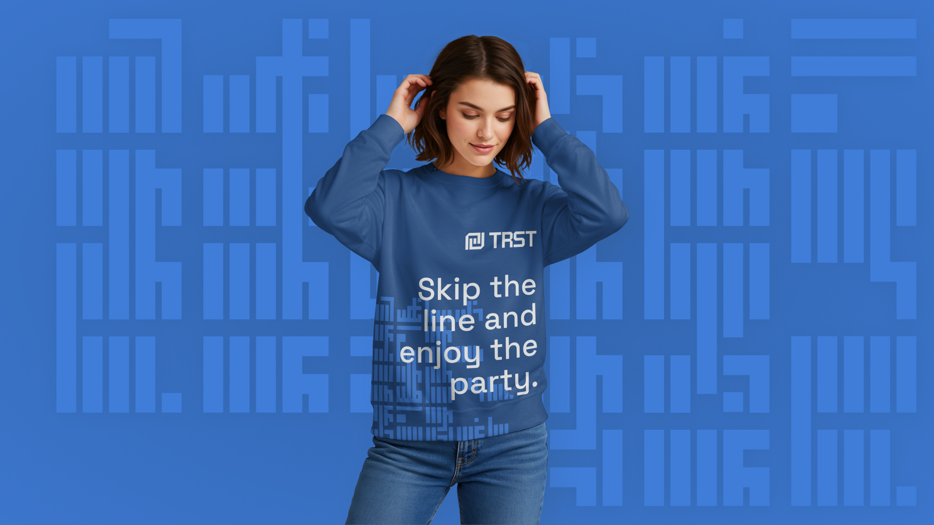
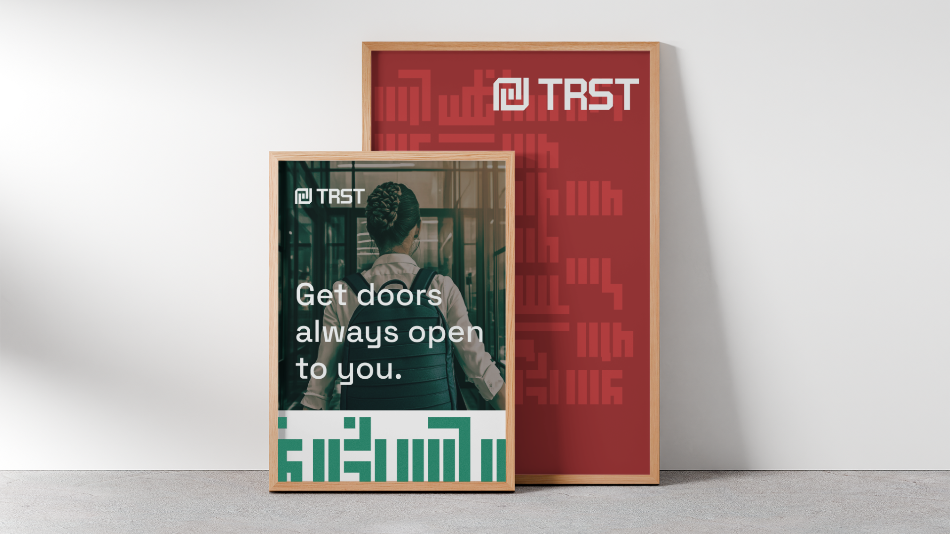
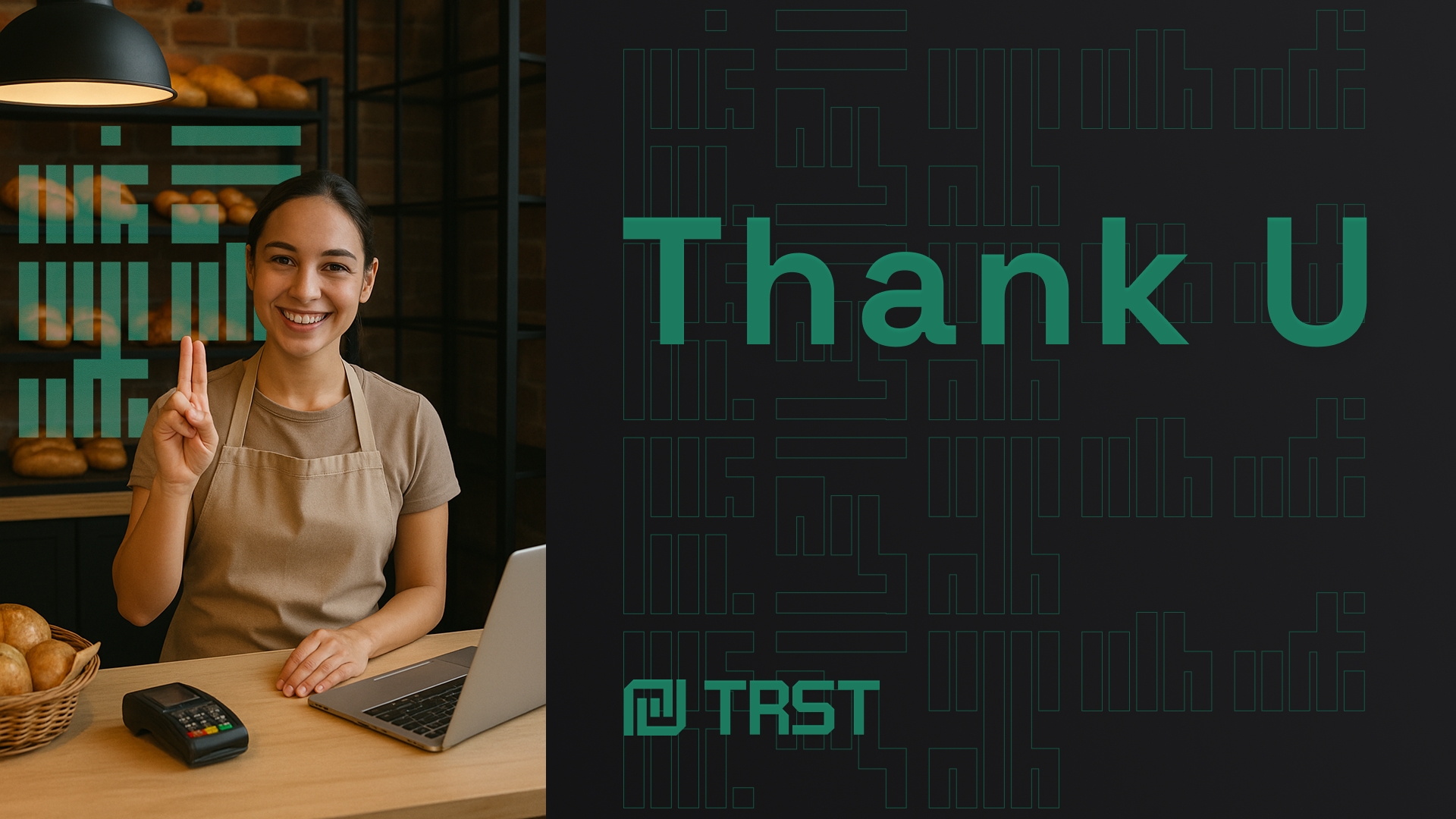
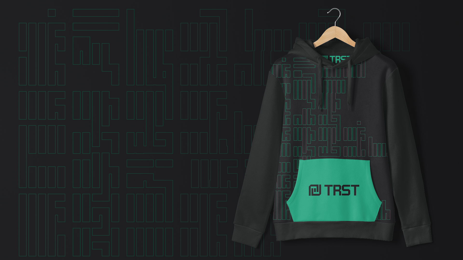
Building on the strategic foundation, I led a complete visual rebrand that embodied the "benefits-first" philosophy. The challenge was translating an abstract shift in messaging into concrete visual language that enterprise decision-makers would immediately understand.
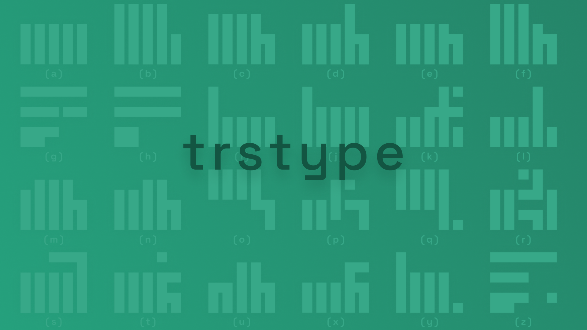
Rather than defaulting to typical tech aesthetics, I drew inspiration from the Atypography movement—a design philosophy that uses complex typography to reduce information overload while creating visual hierarchy. This approach aligned perfectly with Trst's mission of simplifying identity verification.
I developed TrstType, a custom typeface where each glyph is constructed from modular blocks inspired by American Sign Language (ASL). It became the brand's visual language system, applied as patterns throughout layouts to create consistent, meaningful touchpoints.